Progress | South Florida Portrait Studio
Happy Spring. I’m back in the studio after a week at home with my family for spring break. Definite perks to owning my own business.
We are still waiting on final dates from the builder as to when the new studio will be completed. So in the meantime, I met with interior designer, Leslie Mueller to begin the studio design process. These were my requests…
1. work station
2. shooting space
3. client meeting area
Three distinct but very important aspects to my business that need to be consolidated in 300ish sq ft of space, in a design that is modern, clean, and can showcase the COP brand.
She submitted three different design options. I copied and pasted the descriptions directly from her proposals.
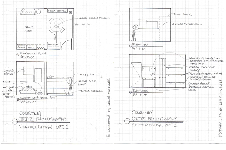
Design Option 1:
Focal wall features logo and sample photography. This plan is more spacious in the client meeting area and the set up of the picture rail and storage cabinet will function well for client consultation. The sofa can be used by family members not in the shoot but then can be easily pulled in as a prop. We will have to double check the final width of the room once the walls are up to make sure there is enough room for everything shown in shoot area- in plan now it is tight! The floor lamp is the tripod style. Are there antique photography lights? If so, maybe we could use one of those as a lamp???

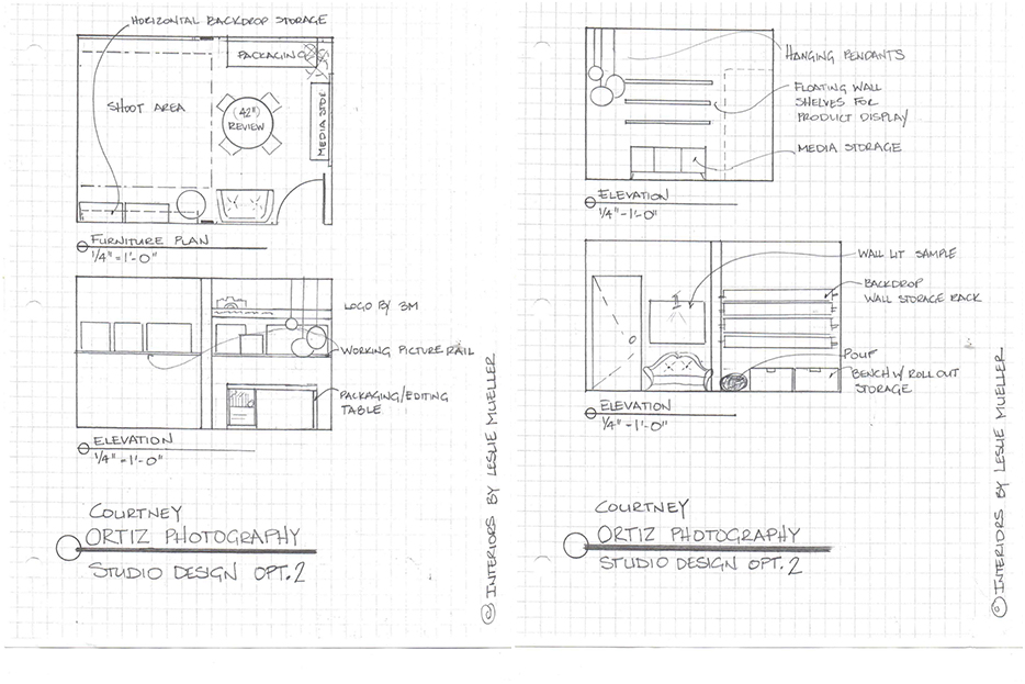
Design Option 2:
The focal wall features your photography!!! Your logo still appears on the focal wall but is set a bit higher on the wall. For fun ( and function) a series of pendants hang from the ceiling in the far corner. The packaging workstation is on the focal wall but the media cabinet is located close so all materials can be stored neatly when clients are expected in the studio. I found a couple counter height tables that have storage built into them, which might be a good option. In this plan, I made the shoot area more spacious by putting the sofa next to the door. I used a smaller meeting table to give some space back.

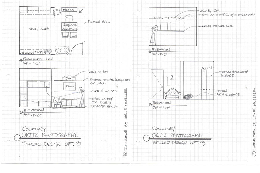
Design Option 3:
In this design, I pictured a typical office set up, where when a client enters the studio, they are greeted by your smiling face, working on whatever, and behind you is the logo, & a big beautiful photograph! The typical office layout functions well bc everything you need is within reach, whether your packaging, editing, or meeting with clients. To keep it from having the stuffy office feel, we would use a fun table and your mix of fun chairs! This plan is probably the most spacious bc the packaging and client meeting are done in one place, eliminating one piece of furniture. There’s also a lot of open floor space in the shoot are for extra props, chairs, etc. (shoot props are shown in plan as the ‘pouf’ – haha!) Not sure how many props you have??
 I definitely have my favorite. Please share in the comments what you are drawn to. I’d love to hear what you think the pros and cons are of each design option. I’ll be making my final decision by the end of the week so we can start to work on the details. I’m really excited to see all of this come to fruition as Courtney Ortiz Photography moves to our new home soon.
See you soon,
court
